

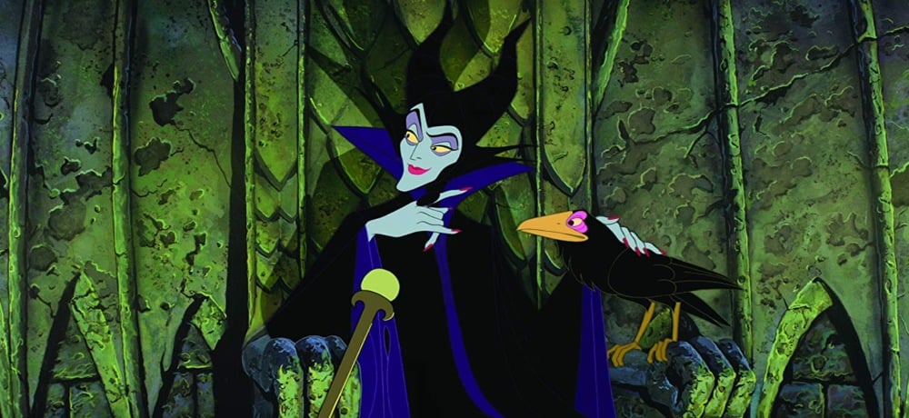
For a solid chunk of my childhood, my favorite movie was Disney's Sleeping Beauty. As film geeks are wont to do, I've spent a lot of time thinking about why I was so drawn to it in my formative years. Little Me was especially fond of two scenes: Princess Aurora’s guardian fairies using magic to settle an argument over whether a gown should be pink or blue, and the fabulously evil Maleficent's transformation into a fire-breathing dragon. I was equally entranced by the fashion as I was by the fearsome monster, and as an adult, that’s no surprise. I especially love freaky films with a solid visual aesthetic, and even more so when they feature fierce women.
For 1959, Sleeping Beauty is surprisingly feminist. The titular Beauty herself is pretty bland, but the climax of the film features three powerful fairies who cast off their guise of domestic normalcy to help defeat an equally-powerful villainess. As a tiny person who was just starting to understand that being a girl automatically meant being seen as weaker, it was exhilarating to see female characters with so much agency—and who appreciated a great look.
Despite the success of the recent Maleficent franchise, Sleeping Beauty tends to fly under the radar for most Disney fans—a damn shame, really, because it’s uniquely beautiful in a way many other classic animated films aren’t. The ornate backdrops, inspired by medieval tapestries and art deco architecture, were spearheaded by artist Eyvind Earle. Stunning as they were, his background paintings were a source of frustration for the film’s animation director, Clyde Geronimi, who later remarked in a 1999 interview, “All that beautiful detail in the trees, the bark, and all that, that's all well and good, but who the hell's going to look at that? The backgrounds became more important than the animation. He'd made them more like Christmas cards."
Upon release in 1959, Sleeping Beauty received middling critical and commercial reception. A particularly nasty Time review called the animation “a compromise between sentimental, crayon-book childishness and the sort of cute, commercial cubism that tries to seem daring but is really just square.” As a result of this lacklustre performance, Sleeping Beauty was the last Disney adaptation of a fairy tale for 30 years, until 1989’s The Little Mermaid.
This criticism of bold aesthetic in narrative film is nothing new, and certainly not within genre film. Horror that blends the visually appealing with the macabre is often derided as silly, shallow, or, the worst of the bunch, prioritizing "style over substance." Smart, nuanced, impressively beautiful horror films have been accused of this crime, despite having quite a bit of substance. But why do we assume style and substance can't merge, and that horror and beauty can't intersect?
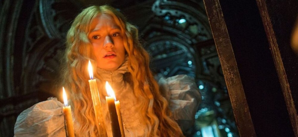
In the years since the release of Guillermo del Toro’s Crimson Peak, the film community has come to embrace its striking visuals, commitment to tone and style, and how it flips the script on the gothic romance genre. But, similar to Sleeping Beauty, reviews upon Crimson Peak’s release saw its lush production design as a detriment rather than a key. The New Yorker called it “…overdecorated with macabre clutter and smothered in shadow…”, and the Chicago Sun-Times was even harsher: “All the carefully orchestrated color schemes and all the dark corridors and secret chambers and all the flowing red metaphors in the world can't accelerate the slow patches, or make us care about lead characters.”
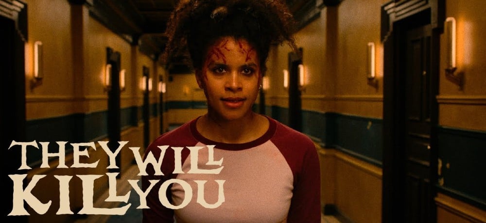
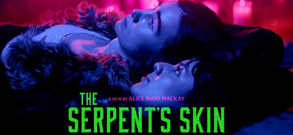
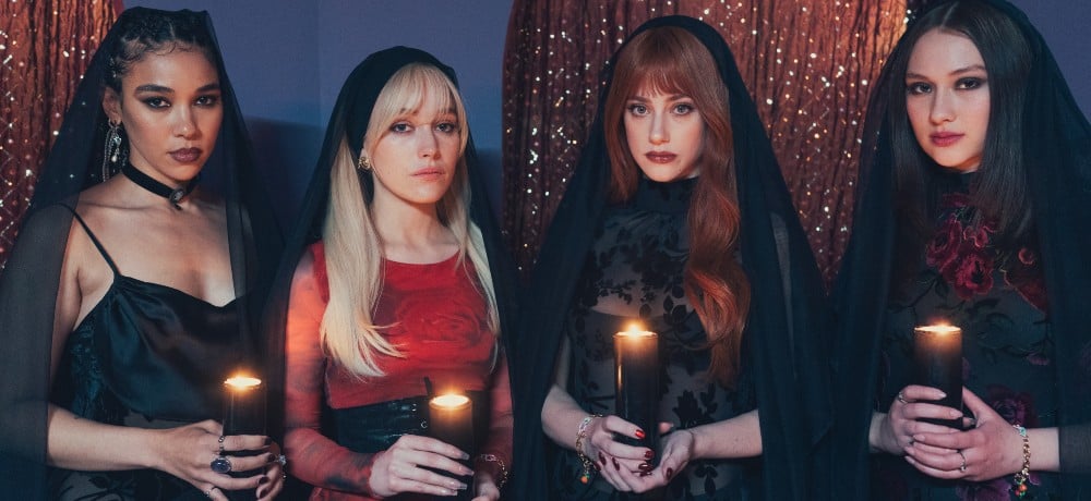
It's easy to think of visual aesthetic as something insubstantial to dazzle and distract us from "real" cinema. The pursuit of beauty itself is thought of as frivolous, and as women, we’re caught in a weird dichotomy: expected to maintain a certain level of attractiveness that hovers right in between "too much" and "not enough." Care too little, and you're a messy slob. Care too much, and you're a superficial narcissist. We hold women who prioritize beauty in contempt, so it’s no wonder we do the same to stylistic films. When one looks at other recent genre films that the “style over substance” criticism has been leveled against, such as The Neon Demon, Midsommar, Suspiria (2018), and Paradise Hills, it’s unsurprising that all are strongly female-centric.
Despite great strides by female creators, as well as a robust community of female fans, horror is still widely marketed to a masculine audience. There is a small, yet intensely vocal, subset of male horror fans that are enraged by films not explicitly made with them in mind—take the hate directed towards the recent Black Christmas remake and its unapologetically “women-first” tone. There’s also the expectation that horror needs to be bloody, gnarly, and fucked up; to achieve a high level of extremity in order to be truly frightening. Beauty and aesthetic have no place within horror if one ascribes to this theory, and there are many fans who still do. But those who don’t know better.
It's this marriage of freaky and pretty that's arresting, the vast gap between something beautiful and something scary slammed shut before our disbelieving eyes. Think the mountain of flowers engulfing Dani as she watches her past burn in Midsommar. The graceful dancer Olga’s limbs splayed into grotesquely contorted shapes in Suspiria. Nina sprouting sharp feathers from her skin in Black Swan. Lithe models eating eyeballs in a strobe-lit room in The Neon Demon. Edith and Lucille dueling to the death in Crimson Peak, their flowing nightgowns drenched in blood. It’s immensely refreshing and empowering to see women in film embrace fashion, style, and beauty without being demeaned for it, especially within the context of a subgenre that we still rarely star in. Costuming, makeup, and production design can make statements just as powerful as gore and guts. And it's possible to be a fierce bitch and appreciate a bold red lip. Just ask Maleficent.