

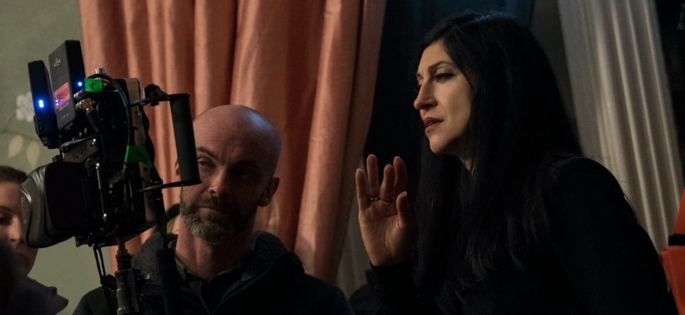
Throughout her decades-spanning career, director Floria Sigismondi has given us a slew of iconic music videos—The Beautiful People and Tourniquet for Marilyn Manson, Little Wonder for David Bowie, Sweet Surrender for Sarah McLachlan, Blue Orchid for The White Stripes, Supermassive Black Hole for Muse, to name just a few—she also directed The Runaways, plus a handful of television episodes, and now she’s set to celebrate the release of The Turning, which is her adaptation of Henry James’ timeless story, The Turn of the Screw.
During the press day for The Turning, Daily Dead spoke with Sigismondi about why she wanted to take on this iconic tale, and her decision to modernize the story by setting the film during the 1990s. Floria also discussed the challenges of taking on a well-known story like The Turn of the Screw as well as some of the stylistic choices she made for the film’s visuals.
Look for The Turning to arrive in theaters this weekend, courtesy of Universal Pictures.
So, was there a reason in particular you wanted to take on adapting The Turn of the Screw?
Floria Sigismondi: Well, I read it when I was 16 and what stayed with me was how you could interpret it in any way. You can read it as a ghost story and then you strip that away and you read it as a woman's descent into madness. So, that really intrigued me. And when you go and buy the book now, I don't know if you've seen it in the bookstores, it's only what, the total 120 pages little novella. But it literally has so many interpretations over the years, everybody's got their interpretation of the symbology; what does Miles represent? What does Quint represent? And so, I love that, because for me it was the perfect framework to do something visual and just come up with my version of it that was a little fresh.
It has been awhile since we've had an adaptation of it. And I'm curious, even though this is set in the ’90s, was there something about bringing it into modern times that appealed to you, in terms of the timelessness of the different aspects of this story?
Floria Sigismondi: Well, I wanted to get rid of technology. That was my first choice. But instead of bringing it to present day, I felt like that era had this wonderful rebellious, angsty quality to it. Especially when it came to the music. It was all about deconstructed fashion, too. It was really a time for me that stands out, and I also thought that I could tie it to Miles. You know, he's got that in him. He's at that stage where he's going from boyhood into manhood, and he's at that stage of choice. So, for him, I could see him having posters of Kurt Cobain on his wall. I also infused these musical instruments in there, too, which gave him something to do. I also upped his age, too, because in the book he's younger. That helped create this tension between Miles and Kate.
Let’s talk about that. Because in The Innocents, there’s this lingering kiss that Miles plants on Miss Giddens. Here, there’s a quick kiss on the cheek, but there’s an uncomfortableness that comes from the way he looms over her when she’s in bed. Were there any sort of concerns over the psychosexual aspects of this story? Because when it is PG-13, I wasn't sure if you intentionally dialed those aspects back so that you could focus on Kate's inner struggles instead.
Floria Sigismondi: Well, there are two things. There are Kate's inner struggles, where she comes in already a little loaded. You get the sense that maybe she's experienced some kind of trauma, right? Either when she was a little girl, Flora's age, or maybe something when she was older, because she really wants to identify with the pain that Miles is feeling, too. Her mother says it, and her roommate says it as well. And then, I think the kids' behavior becomes a catalyst, and the looming feeling of Quint’s toxic masculinity that’s infusing into the picture isn’t helping, either; whether it's through the journals or the story of Miss Jessel, too. They become the keys to opening her up to her darkness more.
So, I think she projects something onto that. And then the idea of how to deal with Miles. I think the fun part of Miles is that he's unpredictable. When he comes in the room at first, it's like, what the hell are you doing there? But then he opens up and you get a sense that he's just a kid and he just wants a mother figure. So, there's this constant back and forth tension that really is centered on Miles. Is he going to succumb to the dark side? Is Quint still badly influencing him, or does he know better? Where's he going to go as a man? And it's about generational abuse and the cyclical kind of abuse and how do you get out of that?
Can you discuss the inherent challenges of taking well-known stories like The Turn of the Screw that have existed in various ways and finding new ways of making them your own?
Floria Sigismondi: There were definitely challenges, because there are things that people just expect. If people know the material so well, then they're just going through the beats of the story. So, some of it is about how do you reimagine a scene? I've changed the ages of the kids, too. But there’s still this idea of how a nanny behaves today versus how they would have behaved in the 1800s. It’s very different.
So, it's about presenting the things that I loved about it, but doing it in a new way. Like seeing Jessel outside the window was one of my moments. There are definitely things that anyone who has read this story or seen an adaptation of it will expect, so I had to find ways to use more surprising elements here.
Before we go, I wanted to talk about the location and the production design in The Turning, because they add so much to the film, and I loved all these little details peppered throughout.
Floria Sigismondi: Well, being a painter and an artist and photographer, all of those details are super important to me. Even the design of the camerawork was meticulously planned out. We created an arc within Kate's look, where you start the film and you've got these big wide shots where Kate's small, but she's in bold colors in this big, cold world. And as things get worse for her, we would get a little bit closer to her with the camera, so that it felt more claustrophobic as the tension starts to build, and her wardrobe changes, too. And then at the end of the film, we were using more handheld shots, so it was a little distorted.
Then, with the production design, we were so fortunate to find this house in Ireland. I knew when we first found it, this was it, because it had the koi pond, it had a creepy lake, and it had that maze. The grounds were huge. So, we were able to get these big expensive shots. With this house in particular, we were able to paint it, and a lot of these other locations we looked at, the estates were controlled. They almost looked like they were museums. We didn't want this house to look like it had this museum kind of look to it. It had to have history, where it looked like in the ’60s, they may have remodeled it and brought Italian furniture in, and in the ’70s, they added some other furniture. So, if you really look at everything going on in the house, it’s all from these different eras, and we were able to make it look really look lived in, too.
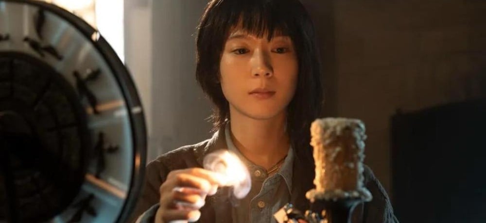
We were even able to put all these details in the wallpaper, too. We had this beautiful wallpaper painted on Kate's wall. By the end of the film, [spoiler warning] during the credit sequence when her hand is rolling against it, you could see that those birds are now upside down and they're falling and the trees and the leaves are brown now, and they're decaying. So there's all these little Easter eggs in here that I put into the film just because that's the kind of stuff I love to do as a visual storyteller.
---------
Visit our online hub to catch up on all of our coverage of The Turning, including more interviews with the cast and crew!