


It was on March 30, 1988 when Tim Burton unleashed one of his most wacky, vibrant and endearing original films on audiences everywhere, the madcap supernatural comedy Beetlejuice which firmly established Burton as one of the most forward-thinking visual storytellers of his, or any generation. While the film might have initially been birthed inside co-writer Michael McDowell’s imagination, Burton relied on an array of talents and artisans to help him bring his vision to life throughout production.
On the effects side of things, there were a handful of extremely talented artists assembled to work on Beetlejuice who were tasked with creating not only the titular character, but all kinds of off-the-wall creatures and entities that made the film a standout amongst its peers that year at the Academy Awards ceremony.
Robert Short, an artist who has worked in Hollywood for more than 40 years now, recalled his initial impressions of Beetlejuice and why it’s not a cinematic experience that can be easily duplicated. “I remember getting the script before meeting Tim so I could prepare myself, and when I read it, it was this wild Tim Burton-esque overlay on this relatively grim horror script, and that created this really unique look for the film and gave us all this wild playground in which we got to work.”
“That’s why Beetlejuice is so unique and out there, because there’s not one specific thing that defines it other than Tim’s style. It’s Tim’s style overlayed on something that’s dark and grim which makes for this very unique mix. The only thing I can compare it to is Gremlins, and that script was initially very dark, very grim, and very horrific, and then Joe [Dante] and Chris [Columbus] just overlayed more comedy on top of that, and that’s why Gremlins was so unique in its style, its look, and storytelling.”
“For example, take the sand worm sequences in Beetlejuice. The way that they were described in the script, it was supposed to look like a scene out of Dune, with all these horrible, brown, ugly worms that are trying to attack everybody. But when I met with Tim, there was a maquette from Rick Heinrichs of the sand worm and the sand worm was black and white stripes with big blue lips and a secondary head inside of the mouth. I was like, ‘What the hell is this [laughs]?’”
When it came time to transform Michael Keaton into the “Ghost with the Most,” Burton hired Ve Neill, one of the most ingenious artists in Hollywood, to create what would become an iconic character that still resonates with film fans after more than 30 years.
“I had really wanted to work on Beetlejuice when I heard about it,” explained Neill. “Bo Welch, who was the production designer on Beetlejuice, came to me and he said, 'Ve, I just got a script for this crazy movie, and you'd be perfect for it. You’ve got to get this movie.’ It just so happened that the production manager, Richard Hashimoto, had been the first AD on 9 To 5. So, I called up Richard, and I asked him to get me an interview with this Tim Burton guy, who was still up-and-coming at the time.”
“I should have realized that I already had an in with Tim, because he had done Pee-Wee’s Big Adventure, and I knew Paul Reubens from when he did The Pee-wee Herman Show at the Roxy. But I didn't think about calling Paul. I was more interested in production and how I was going to get in that way. So, between Bo and Richard, finally, I got an interview with Tim.”
“When I met with him, he was working on the lot over at Culver City Studios in this old construction trailer. There were all these little sketches pinned up everywhere, with pictures of this character that looked like he was scouring trash cans. And meeting Tim himself was amazing to me. He was in his early 20s and looked like a complete freak with this crazy hair and a wrinkled shirt. I loved it. But we did our initial interview, and I think there was one more interview, too, and then I got the job.”
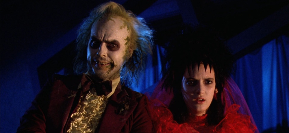
When it came time to deciding on a color palette that would drive the visual style of the characters in Beetlejuice, inspiration came by way of a classic candy that Neill utilized while she was designing Keaton’s character. “One of the first things we talked about were the characters that were in the afterlife. Tim wanted the people in the afterlife to have these pastel colors to them, like Necco Wafers, which are those dreadful candies that come in wax paper. But, we ended up making them much brighter than that, or they wouldn't have shown up well onscreen.”
“Then, we started talking about the Beetlejuice character, and we got Michael in there, and started doing some stuff on him based on Tim’s sketches. It didn't work because he looked too gritty, too realistic, and too creepy-looking. So, I took Michael back again, and I changed him again, but it still wasn’t right. That's when Tim told me to go and do whatever I wanted to do and see what happens from there.”
“My thinking was, if all these other people are pastel colors, then Beetlejuice has to be that way, too. So, I made him pastel yellow. Everybody thinks he was white, but his makeup base actually had yellow in it. We dyed that wig of his several different times until it finally came out like a dirty platinum blonde at the roots, and then it becomes pale yellow with green tips. I put this makeup all over Michael’s face, and I did these big dark circles around his eyes to make him look more cartoony, too.”
“I sent somebody off to a hobby store to buy me some crushed foam and some moss so I could make this guy look like he crawled out from underneath a rock. I'm going to glue all this stuff on him and make it look like he has moss growing out his face and do something really fun with this concept. Something else that was funny was that Michael wanted a fake nose for the character, but we didn't have any money to do prosthetics. My assistant, Steve LaPorte, had some swollen lips already made, so we put one on each side of his nose to make it look broken. And that’s how the look of Beetlejuice came about. Tim was thrilled by what I came up with, too,” Neill added.
For Robert Short, he worked on a myriad of other designs that helped populate Beetlejuice’s afterlife settings alongside several other talented effects creatives. “We had Alan Munro as the visual effects supervisor and Rick Heinrichs, who was the design consultant on the film, too, who’s now gone off to be one of the top art directors in this business. And we also had Tim working with us, of course.”
“The grind of the design elements really would start with Tim, but some would go through Rick, and some of them would go through Alan. My design input was very limited on the show. Where I was concentrating my efforts were on capturing the essence of each design, and put it into three dimensions. A lot of my expertise in that work came from my years in Don Post Studios, doing replicas and furthering my understanding of the design process.”
“One of the things that I had to create was the flying corpse character that had to be this self contained mechanical creature that was reminiscent of Large Marge from Pee-Wee’s Big Adventure. It had to be full scale and worked in real time, so once I did that test and proved to the guys that I could take whatever design they threw at me, we basically just forged ahead from there.”
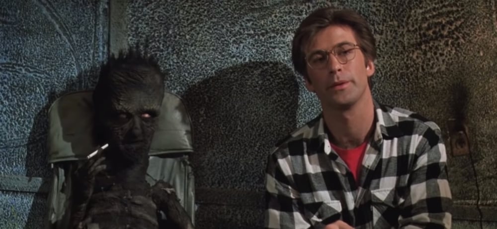
“I also worked on the charred guy who is smoking a cigarette in the waiting room. The sketch that I got from Tim of that guy had these wacky proportions—this oval head with a long neck and a condensed chest, and arms that were twice as long as any arms on a regular human being would be. When I first got the sketch, I went back to Tim and we talked about whether or not I should be using standard human skeletal proportions for this character. I asked Tim if he wanted me to take this basic concept and overlay it onto a human skeleton or if he really wanted me to do it exactly the way he drew it, which felt a bit more fantastical. He told me to stick to the drawing, so that’s what I did.”
“And the charred man is a good example of us blurring the lines of reality and realistic design. His feet are little triangles. The length between his ankle and his knee are twice the length of what a human’s would be. The hips are totally small and we had an actor poking his head through the back of the chair to do the head. We elongated his head and turned it into a slightly oval with an elongated chin, which again, doesn’t look anything like a real human. But when you compare it to everything else, as part of that Beetlejuice ethos of design, it all makes sense within that environment. And I must say that if we had done the charred man the opposite way, where he looked more realistic, it absolutely would have lacked the necessary charm that comes through that character in the film.”
At the 1989 Academy Awards ceremony, it was Ve Neill, Steve LaPorte, and Robert Short who took home the Oscar that year for Best Makeup, which only helped ensure Beetlejuice’s legacy as one of the most unique films to come out during that time.
“While I know we all did exceptional work, I think our ace in the hole at the Oscars was the fact that Beetlejuice was just so bloody popular,” explained Short. “The entire film was just one giant creative exercise for every single person involved, and it shows in the film. We were up against Rick [Baker] for Coming to America and the Burmans for Scrooged, and I was extremely pleased that we won. Rick did some truly groundbreaking stuff for Coming to America and the effects on Scrooged were top notch, but I think there was just something about Beetlejuice that made it really stand out, where everyone in the industry, as well as movie audiences, took notice of what we were able to do on that film. It was an extraordinary experience, and it’s wonderful that time has been kind to Beetlejuice as well.”
Next: Practical-ly Perfect: Celebrating the Special Effects of THE WRETCHED