
The brainchild of horror maestros Stephen King and George A. Romero, Creepshow is a frightening, fun, and faithful ode to the EC Comics of the 1950s. An anthology of classic chills and kills, this collaboration between the genre’s finest creative minds has long been a favorite amongst fans of monsters and the macabre. Along with the spectacular special effects of Tom Savini, Creepshow is often heralded for its brilliantly malevolent, piano-tinged music score by composer John Harrison. Having worked exclusively with Harrison, Romero, and the original master tapes to create the ultimate Creepshow experience, Waxwork Records also enlisted the talent of renowned artist "Ghoulish" Gary Pullin, whose precise palette and vision carved out the vicious visual aesthetic that became the perfect complement to the campy, dark imagery of the film and its audio.
Explaining how he got involved in the project, Pullin notes, “I had worked with Waxwork Records on the Re-Animator soundtrack. It was their first release and it was a really great project and process. After that was released, I knew there would be another collaboration with them down the line. When they emailed me about finding the original master tapes and doing the packaging for Creepshow, I was floored and couldn’t wait to get started.”
“I’m a fan of the film and I’ve seen it many times, but when it came to do the score, I watched it again with a new set of eyes,” Pullin explains. “Creepshow really has it all: great performances, great monsters, Savini special effects, Stephen King, George A. Romero, and of course, John Harrison’s fantastic score. If I had to pick a favorite segment from the film, it would have to be ‘Something To Tide You Over.’ I think Leslie Nielsen really proved his acting chops in that role. He’s really sinister in the film and you believe he’s crazy but still has a conscience. The guilt of his crime haunts him and he really gets it in the end. Ted Danson and Gaylen Ross as the waterlogged zombies look really scary. It’s such a satisfying episode for a horror fan.”
“I work pretty closely with Waxwork on just about every aspect of the design. I like to really explore the films I’m tackling and rough out a lot of concepts. I don’t always like settling on my very first idea. For the Creepshow record, Waxwork wanted to give it the classic ‘EC Comics/Tales from the Crypt’ vibe of the film and it was really exciting to tap into that style. I’m generally inspired by those artists from EC: 'Ghastly' Graham Ingels and Jack Davis. Those guys did it the best. Also, Waxwork is great about suggesting an idea or they’ll hint at a mood or feeling they’d like to see in the record design and that will inspire me, too."
"I would say there’s lots of improvising, but there's also lots of planning. Once we have an idea locked down, depending on the level of illustration, I’ll need to go away for a while and get it done. Usually they just let me go away and do my thing because I’m sure when they come to me for a design, they trust my instincts, too, and they may have a general idea of what I could do with the material. We are always on the same page trying to get to the best artwork we can to honor the music, and that’s part of the reason why we work so well together. They are also as rabid about the horror genre as I am and that enthusiasm is infectious."
Staying within his comfort zone, for his initial concept sketches, Pullin takes a page out of the Crypt Keeper's cookbook. Corrupt men with shadowy and crevassed faces, demonic corpses, dismembered body parts strewn about, and, as always, a pointed satirical, lighthearted edge.
“George A. Romero and Stephen King were referencing grim morality tales from EC Comics' Tales from the Crypt and The Vault of Horror, so we wanted the artwork to reflect something you may see in the pages of an EC Comic,” notes Pullin. “I watched the movie again with my sketchbook and just did some fast thumbnails, but then I moved right onto the computer and refined them from there. I use a Wacom Cintiq drawing tablet now and it’s just amazing. You’re actually drawing directly on the screen and it feels really natural. There's no mess, and fixing mistakes or handling major revisions is a bit easier. The Creepshow art started with one little scratch and then just hours and hours of drawing to build it out. We also wanted the art to look like it was drawn in the ’50s like the EC Comics, and even though I created it all digitally, you would never be able to tell. I work mostly digital these days, but I still like my stuff to have that hand-drawn, organic quality to it.”
In regards to the timeframe of the project, Pullin notes, “It took a long time to get all of the illustrations and aspects of the design done. Again, although we were on a deadline, Waxwork was really great about letting me disappear to get the big chunks done and then I would resurface and present the work and we’d go from there.”
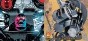
Mirroring the strong, carefully simulated comic book tackiness of the film, Pullin’s lighting and color choice are screamingly vibrant. With all five tales represented equally on the cover and throughout the booklet, the main characters and signature scenes of the movie jump off the page and stalk the eyes with ghoulish delight.
“I wanted to use sort of purples and blue for ‘Father’s Day’ and a swampy green for ‘Something To Tide You Over,’” explains Pullin. “I wanted the meteor [from the second tale, ‘The Lonesome Death of Jordy Verrill’] to tie the whole record together. For me, it’s really the catalyst that kicks the movie off, so that’s why you see it on the cover, the back cover, and the labels. Waxwork had the idea to make the liner notes look like a comic book, so we did. Waxwork spared no expense on this release and that allowed a lot of room to get creative with the packaging.”
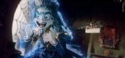
The stunning rendition of the Creeper (the ghostly apparition in the movie's introduction) is also a highlight of the package with a tense, on-edge red and black backdrop perfectly drawing the focus to the phantasm’s bare bones bloom.
“The Creepshow LP was a huge labor of love for everyone involved,” reflects Pullin. “The guys at Waxwork also worked really hard mastering the music, working with Harrison, working with the printers and pressing plants. I can’t imagine the amount of people-hours that went into this thing. I was really impressed with the quality of the printing and the construction of the jacket by Stoughton Printing Co. and what Waxwork did with all of the color vinyl variants, naming each one after the episodes [‘Ocean Blue’, ‘Cake Icing White with Blood Clot Splatter’, and the affectionately titled ‘Meteor Shit Green’], that was genius. I couldn’t be happier with the way it turned out. They even made a skate deck out of the Creeper art insert—another first for me. George Romero’s manager came up to me at a convention and told me how impressed Romero was with the package, so we hooked them up with some records. You can’t beat that.”
Seamlessly tying the film's tales of terror together, Pullin’s potent paints offer up an eerie and eclectic feast for the eye sockets. A visual companion to Harrrison’s brooding analogue synths, the Creepshow artwork digs up a rich feeling of nostalgia for any fans of EC Comics, ’80s horror, or well-constructed artworks with a haunting edge.
Peace to "Ghoulish" Gary Pullin for helping out with this piece. Get your own copy of Creepshow from Waxwork Records. Keep in touch with Pullin on his Facebook, Instagram, Twitter, and official website.
[Editor's Note: This special feature was originally published on BEATDUST in September of 2015.]


![[Guest Article] Maggots On Your Body Of Work: Clay McLeod Chapman On Finding His Own Muses](https://dailydead.com/wp-content/uploads/2026/03/Bodies-of-work-1000-326x150.jpg)
![[Editorial] AI of the Living Dead: Why Have So Many Already Accepted the Simulation?](https://dailydead.com/wp-content/uploads/2025/09/M3GAN-180x83.jpg)

![[Comic-Con 2025] Interview: Michael Giacchino Talks Marvel’s WEREWOLF BY NIGHT: BLOOD MOON and Why He Loves Classic Monsters](https://dailydead.com/wp-content/uploads/2025/07/Werewolf-1000-b-180x83.jpg)