The feature film directional debut of Jason Lei Howden, 2015’s Deathgasm is the perfect party flick for horror hounds and headbangers alike. Taking a blood-soaked page or two out of New Zealand counterpart Peter Jackson’s first feature film, Bad Taste, this satanic-themed splatter-fest also turns things up to "11" with a soundtrack filled with some of black metal’s finest. Needing an artist to capture the essence of the film for the vinyl release, Death Waltz Records commissioned Sam Turner to dish out a devilish display for the album’s cover art.
“I got involved in the project through Jay Shaw, who works for Mondo," explained Turner. "We are fairly good friends and he knows that I’m into drawing and my music tastes.” Having established himself within metal circles due to his gruesome illustrations, it was only a matter of time before he tangoed with the Mondo-affiliated Death Waltz.
“I have done artwork and logos for several bands: 3 Inches of Blood, Black Breath, Holy Grail, Nekrofilth, Speedwolf,
Khemmis, Iron Reagan, Power Trip, In the Company of Serpents, Le Matos, and Denver’s metal Brewery, TRVE Brewing Co. I am a fan of some black metal, bands like Dark Throne, Emperor, Burzum, Watain, and [Shaw] said I should be a good fit for [the Deathgasm] soundtrack."
“Death Waltz pretty much had me speak with [producer] Ant Timpson and Jason Lei Howden through emails and it was pretty straightforward. They said to draw what I felt best described the film. I had not seen the movie yet, but they sent me a copy of it to watch—it wasn't released yet at the time.”
Inspired by some of hard rock's most memorable album covers, Turner channelled the aesthetics of artists such as Derek Riggs, Vincent Locke, and Don Brautigam for the Deathgasm piece.
“I wanted the art to be based off the film’s characters in a lifelike sense, but [also] give it a painted colorful look of the early thrash, death, and just plain good old metal albums that were painted/drawn by artists in the ’80s and ’90s.”
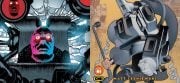
At the climax of a brutal black metal-inspired brainstorm, Turner put lead to paper and crafted a demonstration of his thoughts for the label to look over.
“I sent in a pencil sketch that was pretty similar to the finished product for the most part,” Turner reflects. “Being my first soundtrack cover, I guess I wanted to get everyone in there like a movie poster of sorts. For the inner gatefold art, I decided I should do artwork like Brodie [the character played Milo Cawthorne] did in high school, so I redrew a few of the images I had done and made a few up of my own just doodling all over the paper in markers and ballpoint pens like I imagined he would—very much like my high school days now that I think about it.”
“After handing the concept sketches in for review, I was surprised and happy on the responses I got—no surprise coming from [Timpson and Howden]. They asked that I make Aeloth look directly forward as opposed to a slight profile, which I had planned, and to draw more dongs and sex toys floating about! Haha. That was it. No other changes. I right then knew this was going to be fun.”
Viciously vintage, Turner is one of a dwindling collection of artists who can create brilliance working solely with inks and pencil.
NSFW:
“I like drawing with the color pencils for the look it gives, and it seems to go a lot faster than other mediums” he notes. “I drew the piece on a sand-brown piece of art board—a very smooth paper surface that takes color pencils, ink, and paint very well. I mainly drew the entire image with Prismacolor color pencils, watercolor brushes, Prismacolor and Pantone markers, and a little acrylic paint. I wanted to keep the image softer and colorful. I did the font/logo for the cover as well, obviously paying homage to black metal logos. I inked in microns solid black originally, and then inverted the image so that it was white. I tend to paint or draw backwards a lot, where I focus on the main image and then I do the background last."
"Finally, the inside art was just random ink pens and a blue ballpoint pen. The process was very similar to other pieces I've done, and it probably took a couple of weeks (on and off) to complete.”
Reflecting back on his artwork for the soundtrack to one of the cult hits of 2015, Turner notes, “I was happy with the Deathgasm piece, but there's always a lot of things I thought I could have done differently or better. I wanted people to see a cover that screams out, this is METAL! And I wanted people not familiar to be drawn to it in a somewhat fu**ed up horror sense. There's a lot of stuff going on—is this a band? A movie? What the f*** is this? Is that a suction dildo? Pretty much what I feel Jason Lei Howden did with this film: good fun horror with metal as a main focus. It was great to work with some of these people and some I can somewhat refer to as new friends. Who knows, maybe I can do more art with Jason when he makes another movie!”
The melding of some of the latest and greatest within the metal genre, the Deathgasm soundtrack is twelve inches of brutality. Matching the film step for step, Sam Turner’s cover art walks the fine line between classic ’80s satanic splatter and immaculately drawn immaturity, making it one of the must-have vinyl releases of the year.
---------
Peace to Sam Turner for helping out with this piece. Deathgasm is available for purchase at
mondotees.com. Check out Turner’s other works at his Instagram page @unicorpsegrinder.


![[Guest Article] Maggots On Your Body Of Work: Clay McLeod Chapman On Finding His Own Muses](https://dailydead.com/wp-content/uploads/2026/03/Bodies-of-work-1000-326x150.jpg)

![[Editorial] AI of the Living Dead: Why Have So Many Already Accepted the Simulation?](https://dailydead.com/wp-content/uploads/2025/09/M3GAN-180x83.jpg)

![[Comic-Con 2025] Interview: Michael Giacchino Talks Marvel’s WEREWOLF BY NIGHT: BLOOD MOON and Why He Loves Classic Monsters](https://dailydead.com/wp-content/uploads/2025/07/Werewolf-1000-b-180x83.jpg)