A contemporary twist to a well-trodden tale, Hammer’s Dracula A.D 1972 tried to breath new life into the Count by transporting him from the grim gravestones of Transylvania to the stomping grounds of swinging London. To mirror the modern approach to the film, composer Mike Vickers replaced the classic orchestral scores of the past with a collection of modernist, pop-jazz-styled rhythms. With Death Waltz resurrecting the Count for a limited vinyl reissue, the label unearthed graphic artist Silver Ferox to bring a fresh and frightful concept for the cover artwork.
Bringing the gothic charms of Hammer’s Dracula series into the 20th century was never going to be an easy task and while it felt the scorn of critics worldwide, it staked out a special place in Ferox’s heart.
“I was a huge fan of A.D. 72, in fact, it’s possibly my favorite Hammer movie,” Ferox notes. “I’ve never understood the derision this one constantly receives—I consider its critics to be unreliable. The intro alone, with Van Helsing battling Dracula atop a runaway carriage, trumps the finales of most of the previous entries and the movie moves along at a decent pace, has great music, gorgeous actresses, regional accents and amusing dialogue, as well as a sense of place and a proper dark red claret.”
Explaining how he got involved with the project, Ferox reflects, “I read on the Spin the Blackest Circles forum that Dracula A.D. 1972 was in the pipeline, so, having already started on a fan art piece in my spare time, I pitched this unfinished draft to Spencer [Death Waltz founder] and he agreed that it would be ideal for the jacket art. Since my initial draft had already been approved, it was all systems go.”
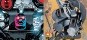
Dripping in grim and grandiose elements of gothic grindhouse, Ferox’s impeccable use of film photography is the focal point of the Dracula A.D. 1972 cover art.
“The overall inspiration for the artwork was taken from traditional photomontage, a technique that used to appear a lot on ’60s and ’70s posters in general,” notes Ferox. “I love that sense of spontaneity and deft placement which can come across as both naive and yet assured and has a sense of immediacy that’s ideal for advertisements."
To sink teeth into this time-honored technique, Ferox explains, “The jacket design was created in Photoshop using hi-res scans of original international lobby cards and stills, plus some frame grabs I took from an HD movie file. It was then a case of laboriously cutting out each image and assembling them together for the montage. Hard to say exactly how long the jacket took to complete, but it was bloody ages. Just sourcing all the stills I wanted to use took about a month. I remember that I had originally put three lines of images on the back cover, which was reduced to two at Spencer’s request, resulting in more room for the text to breathe. Sometimes you have to leave out the kitchen sink.”
With Dracula A.D. 1972 staking out its place in vinyl shelves across the globe, Ferox looks upon the final package with ghoulish delight.
“Death Waltz did a bang-up job with the printing and pressing and released a very high-quality product. The only impression I ever want to give when it comes to utilizing art and design to promote movies/OSTs I grew up loving is to retain a sense of the era and tone of the actual movie itself. That’s why I use original stills and images as much as possible alongside appropriate typography.”
While often viewed as a nail in the coffin for their floundering franchise, Hammer’s Dracula A.D. 1972 does offer up a soundtrack dripping in timeless, fearsome funk. Matching the ghoulish grooves step for step, Silver Ferox dishes up a colorful palette of digital dread that deserves its place on your vinyl shelf based on aesthetics alone.
Peace to Jeremy from Silver Ferox for helping out with this piece. To learn more about the Dracula A.D. 1972 vinyl soundtrack, visit mondotees.com. Check out Silver Ferox’s official website for updates and other graphical work.


![[Guest Article] Maggots On Your Body Of Work: Clay McLeod Chapman On Finding His Own Muses](https://dailydead.com/wp-content/uploads/2026/03/Bodies-of-work-1000-326x150.jpg)

![[Editorial] AI of the Living Dead: Why Have So Many Already Accepted the Simulation?](https://dailydead.com/wp-content/uploads/2025/09/M3GAN-180x83.jpg)

![[Comic-Con 2025] Interview: Michael Giacchino Talks Marvel’s WEREWOLF BY NIGHT: BLOOD MOON and Why He Loves Classic Monsters](https://dailydead.com/wp-content/uploads/2025/07/Werewolf-1000-b-180x83.jpg)