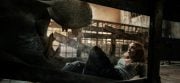
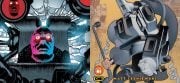
Based upon a frightening fable penned by Clive Barker, the Candyman film series not only delivered a refreshing, sophisticated story—it also gave the horror genre a tragic and terrifying new boogeyman to fear in Tony Todd’s sinister portrayal of the title role. As the composer for both the original and follow-up film, Philip Glass’s cold soundscapes helped bloom the dark urban dystopia that resonated on the screen, complete with one of the most iconic movie themes of modern cinema. Summoning up Jeremy from Silver Ferox to create the hazy kodak visuals, One Way Static’s vinyl release of both Candyman and Candyman: Farewell to the Flesh captures and crystallizes the foreboding dread both sonically and visually in a stunning and sugary release.
Reflecting upon the task of visually complementing Glass’ sharp, splintered score, Jeremy explains, “I’ve admired Glass’ music ever since I saw/heard Koyaanisqatsi about 25 years ago. Glass’ trademark escalating and hypnotic layering repetition of sound for that movie was the perfect aural equivalent of the time-lapsed visuals, and both his Candyman scores employ similar arpeggiating progressions that I wanted to graphically tap into.”
“For the original Candyman vinyl, One Way Static informed me that Philip Glass’ people needed to approve the artwork and suggested that a classy approach might be appropriate,” noted Jeremy. “I had carte blanche (but not a blank check!) to come up with a concept, the construction of which was destined to partly consist of photo images from the production, since using original movie imagery is often my preferred approach when dealing with movie-related projects. That’s one of the reasons One Way Static chose me, since they also champion the use of original stills material in their products, especially if those images we’ve all come to be so familiar and fond of are utilized in a reinvigorated and contemporary manner.”
“Everything was done in Photoshop,” Jeremy continues, commenting on what tools were used for the artworks. “There’s no better approach if your main task is photo manipulation. Utilizing HD screen captures ensured the inclusion of the element of ‘film on paper’ in the design.”
A macabre master within the new age of graphic design, Jeremy’s introduction into the the realm of digital manipulation came from the pulp of some of horror’s more traditional titles. “The Alien photo novel and Fangoria magazine were hugely influential in my youth, since they allowed me to view the movies that I was too young to get into the cinema to see, albeit in still-photo form. Since it’s actually primarily the movies themselves that I’m in love with rather than the artwork, still-photos always got my attention rather than illustrations.”
Using the dusted pages of the past as inspiration for his future works, Jeremy also expanded his search to more abstract mediums for inspiration for the Candyman cover arts. “There was definitely an aesthetic of freshness, purity, and balance to the whole Candyman/Candyman 2 design that I felt I wanted to achieve, and often these sensations are instilled through looking at a variety of different media, ranging from traditional fine art to automobile design to the layout of furniture catalogs.”
“Alongside absorbing the movie and soundtrack, my process begins with a period of research collecting all available images from the movie, including posters/stills/media release artworks to enable me to gain as much of an overview as I can of the existing visual treatments. I see what elements have been explored and this usually gives rise to certain avenues within my own designs. If the movie is available on Blu-ray, then I’ll buy it and comb the entire movie for HD screen captures that I can maybe utilize for my design. Without the advent of HD versions of these films from which one can pull print-quality images, we’d be stuck with using the same old sets of stills that have been around since the movie’s original release (providing any are available). HD transfers are for the moment the final undiscovered country for sourcing original images, extractable down to the exact choice of frame.”
Bleary and contemplative, the cover works showcase a "less is more" quality, excelling in the ideology that simplicity and clarity lead to good design. Offering up a clean, almost scientific approach, Jeremy contains the anarchist nature of the arthropod aesthetic within the confines of a chemical, seamless pattern. The foreboding terror seems to build between the releases, with the bees escaping the hive, growing to a swarm, and manifesting themselves to the surrounding environment.
Delving deep into the concept and construction of the cover arts, Jeremy explains, “I remember how impressed I was with the opening credits sequence of Candyman, which consists of a tracking aerial shot of an urban setting, all geometric concrete shapes gliding along in a serene manner, perfectly embodying the structure and ambience of Glass’ score. This gave me the idea of creating a geometric honeycomb grid that follows from the front to the back cover of the LP gatefold design—a device to convey the repetition and geometric score structure, plus the bee element in the film, whilst also enabling me to create a space into which I could contain an image of the hive from the movie."
“When it came to designing the Candyman 2 LP, it became a natural progression to use this same template once more, modified slightly to adapt to the new movie image of the tree, swarm, and landscape. The landscape capture was also chosen since it appropriately conveyed the sparse and haunting musical tone, the bee theme, plus it comfortably fit the expanse from the front to the back of the LP cover so that the entire outer gatefold could be viewed as a two-panel image.”
Excelling in another fundamental element that separated the horror genre from its cinematic peers is Jeremy’s technically brilliant use of typography. Essential for enhancing a theme, adding personality, and crafting aesthetic appeal, Jeremy’s use of bold colors, sharp fonts, and letter manipulation draws attention to the eyes and quite literally hooks the viewer in.
“The text layout and font was also a key element to convey a certain elegance and was the result of scrolling through thousands of font styles before I made a decision,” Jeremy notes. “As much as I can, I create a variety of mockups in order to show my client various options for the design, and often this is tied to the amount of usable images I have to play with. In the case of the Candyman OSTs, both designs were approved very quickly, which is always a relief when I have limited resources.”
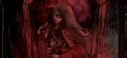
Taking us inside the vinyl’s horrific honeycombs, Jeremy continues, “The explicit tone of the inner gatefold image is in contrast to the front cover design and showcases Candyman himself, yet is still a hand-painted version from the movie, which was in line with the overall abstraction of the package design I wanted to communicate. The vinyl labels also feature spray-painted Candyman images from the movie, ensuring that the ideology carries through to every aspect of the package and its details, such as this, that I know the purchasers appreciate as much as anything else.”
“An important part of the process is also allowing the design to develop alongside my critical perspective as it gets refined with each subsequent daily assessment.” Trying to piece together a timeframe for the completed works, Jeremy remarks, “The sweet spot time of day for me lasts a few hours, so I use that time for my vital work and spread the entire project out over a few weeks.”
Casting a fine eye over the finished product, Jeremy notes, “Part of the whole package’s appeal is the fact that One Way Static uses old-school tip-on jackets and high grade materials for printing to enable quality reproduction and longevity, so I was very pleased to see my design realized on such a great support.”
A dark wind change of depressed pianos and subtle symphonies, Glass’ Candyman compositions grip the listener with a barrage of beautiful and powerful moments. Evoking the same tense feeling from the eyes as it does with the ears, Jeremy’s ominous, clinical use of cinematic cuts is a masterclass of digital distortion and gives this cult classic the respect it deserves.
Peace to Jeremy from Silver Ferox for helping out with this piece. Both Candyman & Candyman Part 2 : Farewell to the Flesh were released by One Way Static—track them down and let your turntable be their victim. Check out Silver Ferox’s official page for updates and other graphical work.
[Editor's Note: This special feature was originally published on BEATDUST in November of 2015.]


![[Guest Article] Maggots On Your Body Of Work: Clay McLeod Chapman On Finding His Own Muses](https://dailydead.com/wp-content/uploads/2026/03/Bodies-of-work-1000-326x150.jpg)
![[Editorial] AI of the Living Dead: Why Have So Many Already Accepted the Simulation?](https://dailydead.com/wp-content/uploads/2025/09/M3GAN-180x83.jpg)

![[Comic-Con 2025] Interview: Michael Giacchino Talks Marvel’s WEREWOLF BY NIGHT: BLOOD MOON and Why He Loves Classic Monsters](https://dailydead.com/wp-content/uploads/2025/07/Werewolf-1000-b-180x83.jpg)